
Web Usability: How to Create User-Friendly Websites
Web usability is one of the key factors that affect the success of websites. It’s a set of rules, principles, and recommendations that aim to make it easier for users to interact with a website. Good usability ensures that visitors can easily find the information they need, accomplish their goals, and have a positive user experience. This concept is important not only for everyday users but also for businesses looking to maximize the effectiveness of their online activities.
What is Web Usability?
Web usability refers to how easily users can interact with a website, find information, and accomplish their goals. In simple terms, it’s about making websites intuitive and user-friendly. For example, if you run an online store, good usability means that customers can easily find products, add them to their cart, and complete their purchases without unnecessary complications.
Web Usability: Creating User-Friendly Websites
Web usability is one of the key factors that affect the success of websites. It’s a set of rules, principles, and recommendations that aim to make it easier for users to interact with a website. Good usability ensures that visitors can easily find the information they need, accomplish their goals, and have a positive user experience. This concept is important not only for everyday users but also for businesses looking to maximize the effectiveness of their online activities.
What is Web Usability?
Web usability refers to how easily users can interact with a website, find information, and accomplish their goals. In simple terms, it’s about making websites intuitive and user-friendly. For example, if you run an online store, good usability means that customers can easily find products, add them to their cart, and complete their purchases without unnecessary complications.
How Good Usability Affects Your Website
A website that follows usability guidelines can positively impact:
User Satisfaction
Users enjoy returning to well-designed websites. Key factors include:
- Intuitive navigation
- Clear content organization
- Fast loading times
- Responsiveness on different devices
- Readable text
- Visual clarity
- Overall aesthetics that create a good first impression
When users find your website easy to use, they’re more likely to stay longer and return in the future. Think about websites you enjoy using – they probably have clean designs, are easy to navigate, and quickly give you what you’re looking for.
Conversions
A website with good usability increases the likelihood of purchases, sign-ups, or other desired actions. This is supported by:
- Simple processes for ordering, form completion, or registration
- Clear calls to action
- Smooth functionality of all interactive elements
- Website trustworthiness – secure payment methods, transparent terms and conditions, and customer support increase users’ willingness to complete desired actions
Studies show that improving usability can increase conversion rates by 10-50%, depending on the starting point and the improvements made.
Search Engine Optimization (SEO)
Search engines like Google rank pages higher when users spend more time on them and when they have low bounce rates. Contributing factors include:
- Quality content and structured information
- Technical aspects like fast loading times
- Proper internal linking
- Mobile optimization
Clear navigation and an understandable site structure help search engines better index content, leading to better visibility in search results.
Credibility
Users feel more comfortable and are more willing to take desired actions if a website appears professional and secure. Important elements include:
- Transparency of information (contact details, terms of business, privacy policies)
- Reviews or certifications
- Professional design
- Up-to-date content
- Error-free functionality
Research has shown that 75% of users judge a company’s credibility based on their website design.
Accessibility
Websites should be easily usable by the widest possible group of users, including people with disabilities. Key considerations include:
- Proper text contrast
- Keyboard navigation
- Simple language
- Support for assistive technologies
Making your website accessible not only broadens your audience but can also improve your SEO rankings and help you comply with legal requirements in many countries.
Key Principles of Web Usability
There are several basic rules that every designer and developer should follow.
Simplicity
Simplicity means minimizing distracting elements:
- Use a clear information hierarchy (headings, subheadings)
- Limit the number of elements on a page (e.g., fewer menu items)
- Simplify processes – forms should only contain necessary fields
Example: Amazon’s “1-Click Purchase” feature simplifies the buying process to a minimum.
Consistency
Consistent design helps users navigate better:
- Same navigation style on all pages
- Consistent colors and typography
- Predictable placement of common elements (logos, search bars, menus)
Example: IKEA uses the same page layout across its entire website, making navigation easier.
Loading Speed
Loading speed has a crucial impact on user satisfaction:
- Optimize images (e.g., WebP format)
- Minimize JavaScript and CSS
- Use fast servers and content delivery networks (CDNs)
- Implement browser caching
Example: Google Search loads in milliseconds thanks to code optimization.
Research shows that 53% of mobile users abandon websites that take longer than 3 seconds to load, and each second of delay can reduce conversions by up to 7%.
Accessibility
Websites should be accessible to all users:
- Responsive design for mobile devices
- Alternative text for images (for screen readers)
- Good contrast between text and background
- Semantic HTML that provides meaning to content
- Support for keyboard navigation
Example: The BBC website offers high color contrast and support for screen readers.
Intuitive Navigation
Navigation should be simple and logical:
- Clearly labeled menus
- Ability to return to the homepage with one click
- The search field is visible at first glance
- Breadcrumb navigation for complex websites
- Limited navigation levels (ideally no more than 3)
Example: Alza.com has a prominent search field placed at the top of the page.
Common Usability Problems
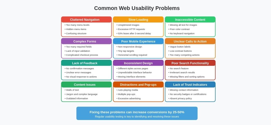
Despite the importance of usability, many websites suffer from common problems:
Cluttered Navigation
Navigation menus should be simple and logically organized. Too many levels or hidden items can confuse users.
Bad practice example: Menus with more than three levels of categories can be confusing (e.g., “Electronics > Phones > Accessories > Chargers”), though there are exceptions for larger shops.
Slow Loading
Pages with large images or poorly optimized code can have long loading times, deterring users.
A study by Google found that as page load time increases from 1 second to 3 seconds, the probability of a user bouncing increases by 32%.
Inaccessible Content
Missing alternative text for images or poor color contrast can prevent people with disabilities from accessing content.
About 15% of the world’s population lives with some form of disability, and excluding them means losing potential customers and visitors.
Unclear Calls to Action
Buttons and links should be clearly labeled and guide users to the desired action.
Bad practice example: A button labeled “Next” instead of the clear “Complete Order” can cause confusion and reduce conversions.
Overly Long Forms
Complex or unnecessarily extensive forms discourage users from completing them.
Bad practice example: A registration form requiring date of birth, phone number, and address for access to regular website content is unnecessary and reduces the likelihood of completing registration.
Forms should only ask for information that’s absolutely necessary. Studies show that reducing the number of form fields from 11 to 4 can increase conversions by up to 120%.
Distracting Elements and Advertisements
Excessive advertisements, pop-ups, or automatically playing videos distract from the main content and worsen the user experience.
Bad practice example: A page with multiple pop-ups (newsletter, cookies, discount coupon) that make immediate use of the website impossible.
Lack of Feedback
Users need clear responses to their actions, such as confirmation of form submission or error messages if something doesn’t work.
Bad practice example: A user clicks the “Submit” button and nothing happens, leaving them unsure if the form was submitted.
Poor Mobile Optimization
If a website isn’t fully responsive, it can be difficult to use on phones and tablets.
Bad practice example: Buttons that are too small for touch control, or text that doesn’t fit on the screen and requires horizontal scrolling.
With over 60% of web traffic now coming from mobile devices, having a mobile-friendly website is no longer optional.
Outdated or Inconsistent Design
Inconsistent use of colors, fonts, and layout elements appears unprofessional and reduces website credibility.
Bad practice example: Buttons on different pages of the website have different styles, colors, and shapes, confusing users.
Missing or Unclear Search Function
If a website has extensive content, it’s important to have an effective search with suggestions and filters.
Bad practice example: An e-commerce site without category search or with results that don’t match the query.
Lack of Credibility
Websites without contact information, customer reviews, or SSL certificates appear untrustworthy.
Bad practice example: An online store that doesn’t list a phone number or physical address, raising concerns about its reliability.
Usability Testing
Usability testing is one of the most important steps in developing websites or digital products. Its goal is to discover how easily and effectively users can interact with the website, find required information, or complete specific tasks.
This process helps identify problems that could deter users and allows for optimization of the user experience (UX).
Why is Usability Testing Important?
Usability testing is a process that analyzes user behavior when interacting with a website or application. The main goal is to determine if the product is intuitive, clear, and easy to use. Testing reveals weaknesses in design, navigation, or functionality that could lead to user frustration.
For example, if an online store has a complicated ordering process or poorly structured menu, customers may not complete their purchases. Through testing, these problems can be identified and fixed before the website launches or in its early operational phase.
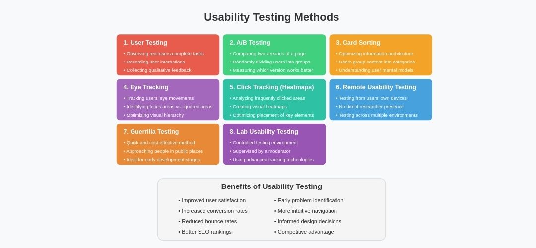
Benefits of Usability Testing:
- Improved user satisfaction
- Increased conversions (more purchases or registrations)
- Reduced bounce rate
- Better SEO rankings due to longer time spent on the page
- Early problem detection before causing greater damage (loss of revenue)
Usability Testing Methods
There are several different usability testing methods that can be adapted to specific project needs. Each method has its advantages and disadvantages and is suitable for different stages of product development.
- User Testing – this method involves observing real users interacting with the website. Users are given specific tasks (e.g., “Find contact information for customer support”), while a researcher observes their behavior and records any problems.
- A/B Testing – A/B testing involves comparing two versions of a page (e.g., different designs for a “Buy” button) to determine which version works better. Users are randomly divided into two groups – each sees a different version of the page – and their behavior is monitored.
- Card Sorting – a method used to optimize a website’s information architecture. Users group content into logical categories and assign them names. This helps understand how users think about content and how it should be organized.
- Eye Tracking – a method that tracks users’ eye movements while browsing a website. It provides insight into which elements users focus on and what they ignore. Often used to optimize a page’s visual hierarchy.
- Click Tracking (Heatmaps) – analysis of areas where users click most frequently. Heatmaps show which elements on a page attract the most attention and help optimize the placement of key elements such as buttons and links.
- Remote Usability Testing – users test the website on their devices from home without the direct presence of a researcher. Results are recorded and analyzed later. This method allows testing on a wide range of devices and environments.
- Guerrilla Testing – guerrilla testing is a quick and cost-effective method that involves approaching random people in a public place (e.g., in a café) and asking them to try out a website or application. This method is ideal for the early stages of product development.
- Lab Usability Testing – laboratory testing takes place in a special environment under the supervision of a moderator. This method allows for deeper analysis of user behavior through the use of advanced technologies (e.g., eye movement tracking).
Practical Tips for Improving Usability
Here are some practical tips you can implement right away:
Follow the “Three-Click Rule”
Users should be able to find what they’re looking for within three clicks. While this isn’t a strict scientific rule, it’s a good guideline for ensuring your site’s navigation is efficient.
Use Familiar Patterns
Users have expectations about where to find certain elements:
- Logo in the top left (clicking it should return to homepage)
- Main navigation at the top or left side
- Search in the top right
- The shopping cart icon in the top right
Prioritize Content Above the Fold
The most important content should be visible without scrolling. This includes your value proposition, main navigation, and primary calls to action.
Use White Space Effectively
Don’t crowd your pages with too much content. Generous white space (empty space) makes content more readable and helps users focus on what’s important.
Write Clear, Scannable Content
Most users scan web pages rather than reading every word:
- Use clear headings and subheadings
- Use bullet points and short paragraphs
- Highlight important information
- Use simple language
Test on Real Devices
Don’t just rely on responsive design tools. Test your website on actual smartphones, tablets, and computers to ensure it works well across all devices.
Use Progress Indicators
For multi-step processes (like checkout), show users where they are in the process and how many steps remain.
Provide Clear Feedback
Let users know when their actions have been successful or if there’s a problem:
- Confirmation messages after form submissions
- Clear error messages when something goes wrong
- Visual feedback when buttons are clicked
Optimize Images
Compress images to reduce loading times without sacrificing quality. Tools like TinyPNG, Squoosh, or built-in CMS optimization can help.
Monitor and Iterate
Use analytics tools to monitor how users interact with your site and make continuous improvements based on real data.
Was this article helpful?
Support us to keep up the good work and to provide you even better content. Your donations will be used to help students get access to quality content for free and pay our contributors’ salaries, who work hard to create this website content! Thank you for all your support!

Reaction to comment: Cancel reply