
Typography: The Art and Science of Type Design
Typography is an essential aspect of design that influences the readability, accessibility, and aesthetics of written communication. It is a discipline that combines art and science, integrating historical traditions with modern innovations to create visually engaging and effective text. Whether in print or digital media, typography shapes the way information is perceived and absorbed by audiences. In this article, we will explore the intricacies of typography, covering its history, fundamental principles, type classification, design considerations, and contemporary trends.
The History of Typography
Typography has evolved significantly from its earliest forms. The invention of writing, dating back to ancient civilizations such as the Sumerians and Egyptians, laid the foundation for typography. The development of movable type by Johannes Gutenberg in the 15th century revolutionized printing and mass communication. With Gutenberg’s press, books became more accessible, leading to the proliferation of literacy and knowledge.
The Renaissance saw the refinement of typefaces, with influential figures like Claude Garamond and Aldus Manutius pioneering serif fonts that remain widely used today. The Industrial Revolution introduced new printing techniques and typefaces, such as slab serifs, to accommodate advertising needs. The 20th century brought further experimentation with modernist and postmodernist typographic styles, while the digital age has enabled unprecedented flexibility in type design and distribution.
The Anatomy of Type
Understanding typography requires familiarity with the components of letterforms. Some key elements include:
- Baseline – the imaginary line on which characters sit. It serves as a reference point for the positioning of letters, ensuring visual consistency.
- X-height – the height of lowercase letters, excluding ascenders and descenders. It plays a significant role in readability, with higher x-heights generally making text appear larger and easier to read.
- Ascender – the part of a letter that extends above the x-height, as seen in letters like “h” and “b.” Ascenders contribute to the distinct shapes of letterforms and influence how fonts interact in text.
- Descender – the portion of a letter that falls below the baseline, such as in “g” and “y.” Longer descenders can affect line spacing, making leading adjustments crucial.
- Serif – the small strokes attached to the ends of letters in serif typefaces. They aid in readability by guiding the eye along lines of text, especially in print media.
- Sans-serif – typefaces that do not have serifs, often characterized by a clean, modern look. These fonts are commonly used for digital displays due to their clarity.
- Counter – the enclosed or partially enclosed space within letters like “o,” “e,” and “d.” The shape and openness of counters affect legibility, especially at smaller sizes.
- Bowl – a curved stroke enclosing a counter, as seen in letters like “d,” “b,” and “p.” It influences the overall form of a typeface.
- Stem – the main vertical or diagonal stroke in a letterform. Stems provide the primary structural foundation of most letters.
- Spine – the curved central stroke of the letter “s.” The curvature of the spine varies between typefaces, impacting the overall style.
- Crossbar – the horizontal stroke in letters such as “A,” “H,” and “e.” Crossbars help define the shape of letters and contribute to balance in type design.
- Ear – a small stroke that extends from the upper-right side of lowercase “g.” It adds personality and variation to typefaces.
- Tail – a descending, often decorative stroke on letters like “Q,” “R,” and “y.” It can add flair to type designs and impact the visual flow of text.
- Kerning – the adjustment of space between individual characters to create a visually pleasing balance. Proper kerning ensures uniform letter spacing and prevents awkward gaps.
- Leading – the vertical spacing between lines of text. Sufficient leading enhances readability by preventing text from appearing too cramped.
- Tracking – the overall spacing between groups of letters. Adjusting tracking can affect the readability and aesthetic appeal of a text block.
- Ligature – a combination of two or more letters joined as a single glyph, such as “fi” and “fl.” Ligatures improve readability and typographic elegance.
- Aperture – the open space in partially enclosed letters like “c” and “e.” A wider aperture enhances readability, particularly at smaller sizes.
- Arm – a horizontal or upward-sloping stroke that is unattached on one end, as seen in “T” and “E.” Arms help create distinct letterforms.
- Swash – an ornamental flourish on a letterform, commonly found in script and decorative typefaces. Swashes add elegance and personality to typography.
- Stroke Contrast – the variation in thickness between thick and thin strokes in a typeface. High-stroke contrast is common in calligraphic and modern typefaces, while low contrast provides a more uniform appearance.
Type Classification
Typography is categorized into several type classifications, each with distinct characteristics and use cases. Choosing the right typeface for a project requires an understanding of these categories and their intended applications.
- Serif fonts – traditional and readable, serif fonts like Times New Roman, Garamond, and Baskerville are commonly used in print, especially in books, newspapers, and formal documents. Serifs, the small strokes attached to the ends of letters, help guide the eye along the lines of text, improving readability in long-form content. There are several subcategories of serif fonts:
- Old-style Serifs – inspired by classical calligraphy, featuring a moderate contrast between thick and thin strokes (e.g., Garamond, Jenson).
- Transitional Serifs – more refined and with greater stroke contrast than old-style serifs (e.g., Times New Roman, Baskerville).
- Modern Serifs – characterized by strong vertical contrast and thin horizontal serifs (e.g., Didot, Bodoni).
- Slab Serifs – a robust subcategory with thick, block-like serifs, often used for headlines and posters (e.g., Rockwell, Clarendon).
- Sans-serif fonts – clean and modern, sans-serif fonts such as Helvetica, Arial, and Futura lack serifs, making them highly readable on screens. They provide a contemporary and minimalist look and are widely used in branding, web design, and user interfaces. Common subcategories include:
- Grotesque Sans-serif – the earliest sans-serif typefaces, featuring slightly irregular letterforms (e.g., Franklin Gothic, Akzidenz-Grotesk).
- Neo-grotesque Sans-serif – more refined and neutral, making them highly versatile (e.g., Helvetica, Arial).
- Geometric Sans-serif – based on geometric shapes, with clean, precise letterforms (e.g., Futura, Avenir).
- Humanist Sans-serif – inspired by handwriting and calligraphy, providing a warm and natural feel (e.g., Gill Sans, Optima).
- Slab serif fonts – bold and robust, slab serif fonts like Rockwell, Clarendon, and Lubalin Graph are often used in advertising, branding, and signage. They feature thick, blocky serifs that provide a strong, confident appearance. Slab serif fonts are effective for headlines, posters, and digital banners due to their striking presence. They can be further divided into:
- Clarendon-style Slab Serifs – slightly rounded serifs, offering a friendlier look (e.g., Clarendon, Sentinel).
- Typewriter Slab Serifs – monospaced and commonly found in old typewriter fonts (e.g., Courier, American Typewriter).
- Geometric Slab Serifs – based on strict geometric principles, with sharp, clean edges (e.g., Memphis, Beton).
- Script fonts – elegant and decorative, script fonts like Brush Script, Pacifico, and Lobster emulate handwritten styles. These fonts convey a sense of personalization and sophistication and are commonly used in invitations, branding, and artistic projects. Script fonts are divided into:
- Formal Scripts – based on classic calligraphy, often seen in wedding invitations and luxury branding (e.g., Bickham Script, Snell Roundhand).
- Casual Scripts – more relaxed and informal, mimicking everyday handwriting (e.g., Brush Script, Pacifico).
- Handwriting Fonts – mimic natural, human handwriting, often used in personalized marketing and social media graphics (e.g., Dancing Script, Indie Flower).
- Calligraphic Scripts – feature strokes resembling traditional calligraphy, with varying thickness and fluid motion (e.g., Zapfino, Lucida Calligraphy).
- Display fonts – unique and eye-catching, display fonts are designed for headlines, logos, and decorative text rather than body content. These fonts vary widely in style and can be playful, dramatic, or avant-garde. They are highly stylized and can include:
- Decorative Fonts – elaborate, ornamental typefaces often used in themed designs (e.g., Jokerman, Curlz MT).
- Retro Fonts – inspired by past decades, often used in vintage and nostalgic designs (e.g., Bauhaus, Cooper Black).
- Grunge and Distressed Fonts – rough, textured fonts that create an edgy, worn-out effect (e.g., Bleeding Cowboys, Trashhand).
- Experimental Fonts – highly creative and non-traditional, often used for artistic projects and avant-garde designs.
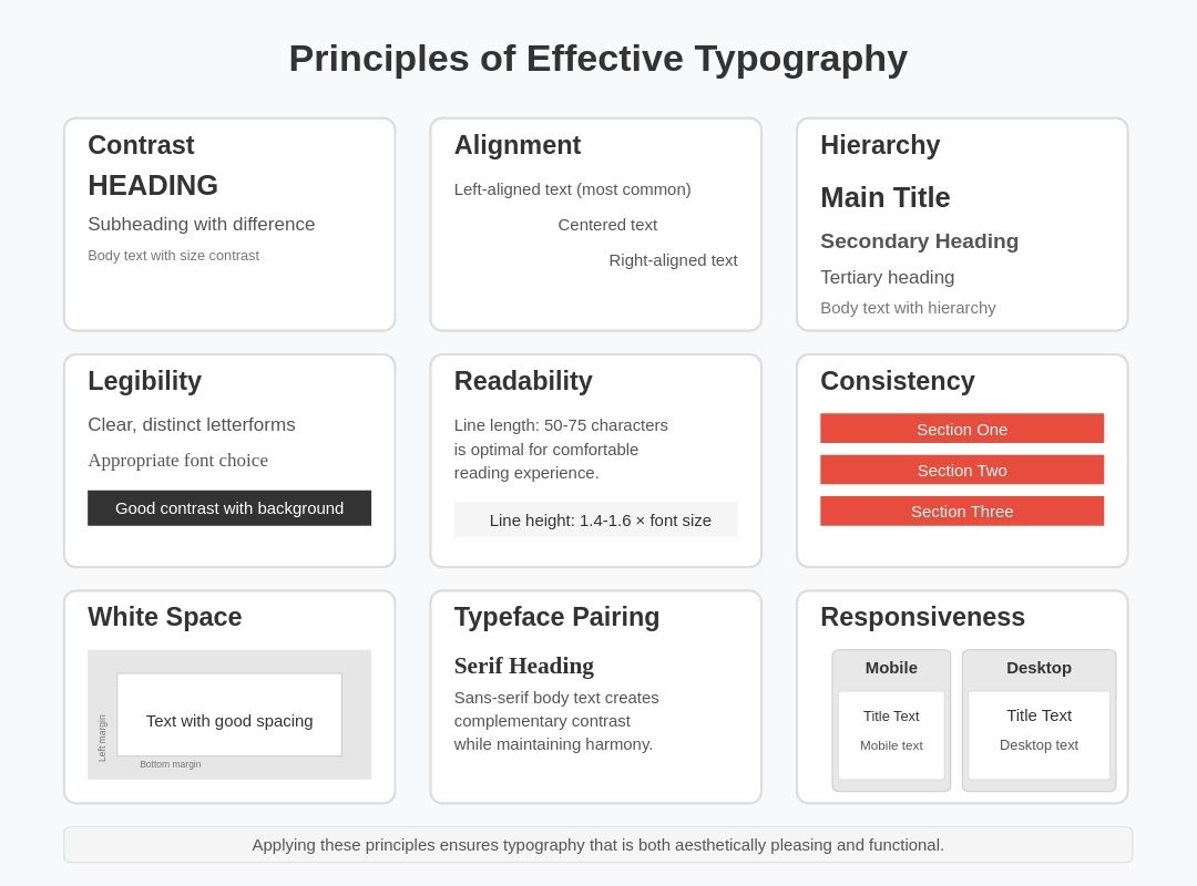
Typography is not just about selecting a typeface; it requires careful consideration of several design principles to ensure optimal readability and visual harmony. Well-executed typography enhances user experience, guides attention, and ensures effective communication across different mediums.
- Contrast – effective typography leverages contrast in weight, style, color, and size to create a hierarchy and guide the reader’s eye. High contrast between text and background improves readability, while variations in type size and thickness help differentiate elements such as headings, subheadings, and body text.
- Alignment – text can be left-aligned, right-aligned, centered, or justified, with each choice impacting readability and aesthetics. Left-aligned text is the most common and easiest to read, while justified text can create clean visual edges but may require careful adjustment to avoid uneven spacing (known as “rivers” in typography).
- Hierarchy – establishing a typographic hierarchy through font size, weight, color, and spacing helps direct attention to key information. Hierarchy ensures that important content, such as headings and calls to action, stands out, while secondary information remains accessible but unobtrusive.
- Legibility – ensuring that letterforms are distinct and easy to read at various sizes is crucial for accessibility. Factors influencing legibility include typeface selection, stroke width, x-height, and character spacing. Sans-serif fonts often perform better on digital screens, while serif fonts excel in printed materials.
- Readability – the overall comfort and ease with which a reader can process text depends on font selection, line length, and spacing. Optimal readability is achieved through appropriate line height (leading), sufficient word spacing, and moderate line length (typically 50-75 characters per line). Avoiding overly decorative fonts for body text also enhances readability.
- Consistency – maintaining uniformity in type usage throughout a design enhances clarity and professionalism. Consistent use of fonts, sizes, and spacing across headings, subheadings, and body text creates a cohesive visual identity. It also ensures that users can quickly scan and interpret information without unnecessary distractions.
- Spacing and White Space – proper use of white space around text improves clarity and prevents visual clutter. Generous margins, line spacing (leading), and paragraph breaks help make content more digestible. White space enhances the structure and balance of a page, improving overall user experience.
- Alignment of Visual Elements – text should align harmoniously with other design components, such as images, buttons, and grids. Ensuring that typography is balanced within the layout creates a visually appealing and professional appearance.
- Typeface Pairing – selecting complementary typefaces enhances design cohesion. Pairing a serif with a sans-serif font often works well, with one serving as the primary text and the other as a supporting element. Overusing different fonts can lead to a chaotic design, so a limited selection (typically two or three) is recommended.
- Scalability and Responsiveness – typography should remain clear and readable across different devices and screen sizes. Responsive typography ensures that text scales appropriately, adapting to mobile, tablet, and desktop displays. Techniques such as fluid typography and variable fonts help maintain an optimal reading experience on all platforms.
Typography plays a pivotal role in branding, shaping the perception of a company or product. A well-chosen typeface conveys personality and evokes emotions, influencing how consumers perceive and interact with a brand. For example, serif fonts may project tradition, reliability, and authority, making them a popular choice for financial institutions, law firms, and editorial publications. In contrast, sans-serif fonts suggest modernity, innovation, and simplicity, making them ideal for tech companies, startups, and contemporary brands. Typography is a silent ambassador of a brand’s values and tone, reinforcing identity and memorability.
Typography in Branding
Brand identity is built on a combination of elements, including logo design, color schemes, imagery, and, crucially, typography. The right typeface enhances brand recognition, ensuring that a company’s visual identity remains consistent across different media. The choice of typography impacts how customers emotionally connect with a brand, setting expectations for its products and services.
Some well-known brands are closely associated with specific typefaces. For example, Coca-Cola’s distinctive script typeface evokes nostalgia and heritage, while Apple’s sleek, minimalist use of the San Francisco font reinforces its brand ethos of simplicity and elegance. Choosing the right font can establish credibility and differentiate a brand from its competitors.
Typeface Selection and Brand Voice
Typography also reflects the tone and personality of a brand. A luxury brand might opt for elegant, high-contrast serif fonts like Didot or Bodoni to exude sophistication, whereas a playful brand aimed at children might use rounded, bubbly fonts to create a friendly and approachable feel. Similarly, a minimalist brand may prefer a clean, geometric sans-serif font, which emphasizes clarity and modernity.
The psychological effects of typeface choices play a crucial role in branding. Fonts with sharp, angular lines can evoke strength and precision, making them popular in industries like technology and automotive design. Conversely, fonts with rounded edges feel softer and more welcoming, commonly used by lifestyle brands and wellness companies.
Consistency in Typography Across Brand Touchpoints
To maintain brand consistency, typography should be uniform across all brand touchpoints, including websites, marketing materials, social media, packaging, and print advertisements. Inconsistent type usage can dilute brand identity and reduce trustworthiness.
Many brands develop custom fonts to establish a unique and recognizable visual language. For instance, Google created the custom sans-serif typeface “Google Sans” to reinforce its brand identity across digital and print platforms. Similarly, Netflix employs “Netflix Sans” to ensure its branding remains distinct and cohesive worldwide.
The Impact of Typography on User Experience (UX)
In user experience (UX) design, typography is much more than a stylistic choice—it directly influences usability, readability, and engagement. Web designers must carefully consider various factors to create a seamless experience for users across different devices and screen sizes.
Readability and Legibility
Typography affects how easily users can consume information. Readability refers to how comfortable it is to read large amounts of text, while legibility concerns the clarity of individual letterforms. Poor typography choices, such as using an overly decorative font for body text or insufficient contrast between text and background, can cause eye strain and discourage engagement.
Responsive Typography and Accessibility
As users interact with websites on desktops, tablets, and mobile devices, responsive typography ensures that text remains legible and aesthetically pleasing across different screen sizes.
Scalable Typefaces and Accessibility Considerations
- Scalable Typefaces – using relative units like ems or percentages instead of fixed pixels ensures that text adapts to varying resolutions.
- Line Height and Spacing – proper line spacing (leading) improves readability by preventing text from appearing cramped or too loose.
- Contrast and Color Considerations – sufficient contrast between text and background is essential for accessibility, particularly for visually impaired users.
- WCAG (Web Content Accessibility Guidelines) – compliance with accessibility standards ensures inclusivity, making content readable for users with disabilities.
We will talk about all these points more in detail. Let’s start with the Scalable Typefaces.
Scalable Typefaces
Using relative units like ems, percentages, or viewport width (vw) instead of fixed pixels ensures that text adapts to varying resolutions and screen sizes. This approach allows typography to scale dynamically, improving readability across different devices, from smartphones to large desktop monitors.
- Benefits of scalable typefaces:
- They provide greater flexibility and responsiveness, ensuring that text remains legible regardless of device or screen size.
- They allow users to adjust text sizes in their browser settings without breaking the layout.
- They improve accessibility for individuals with visual impairments who rely on zoom functionality to read text comfortably.
By implementing CSS properties such as font-size: 1.2em or font-size: 120%, designers can create more fluid and adaptable typographic experiences.
Line Height and Spacing
Proper line spacing (leading) is crucial for readability, ensuring that text does not appear too cramped or excessively loose. Well-structured text improves comprehension and reduces eye strain, enhancing the overall reading experience.
- Key considerations for line height and spacing:
- The optimal line height is typically 1.4 to 1.6 times the font size, which provides sufficient space between lines without making the text feel disconnected.
- Adequate paragraph spacing prevents text blocks from blending together, allowing readers to scan content more efficiently.
- Spacing adjustments should be tested across different resolutions to maintain a comfortable reading experience on all devices.
Contrast and Color Considerations
Sufficient contrast between text and background is essential for both readability and accessibility. Poor contrast can make text difficult to read, especially for users with low vision or color blindness.
- Best practices for contrast and color selection:
- Ensure a high contrast ratio between text and background (WCAG recommends a minimum contrast ratio of 4.5:1 for normal text and 3:1 for large text).
- Avoid placing text over busy or complex background images, as this reduces clarity.
- Provide options for dark mode and light mode, allowing users to choose a contrast level that suits their visual preference.
- Use color-blind-friendly palettes, ensuring that important information is not solely conveyed through color (e.g., pairing colors with icons or underlines for emphasis).
WCAG (Web Content Accessibility Guidelines)
WCAG provides comprehensive standards for web accessibility, ensuring that content is usable by individuals with disabilities, including those with vision impairments, motor difficulties, and cognitive challenges. Adhering to these guidelines improves overall usability and legal compliance.
- Core WCAG principles for typography:
- Perceivable – text must be distinguishable from the background, with adjustable font sizes and alternative formats for non-text content.
- Operable – users should be able to navigate text using a keyboard, screen reader, or voice commands.
- Understandable – readability should be prioritized, avoiding overly complex language, small text sizes, and unclear font choices.
- Robust – text should be compatible with a wide range of assistive technologies, ensuring accessibility across multiple platforms and devices.
The Role of Variable Fonts
Variable fonts enable greater flexibility by allowing multiple styles (weight, width, slant) within a single font file. This innovation enhances performance and customization, providing smoother transitions between different typography styles without loading multiple font files. This is particularly beneficial for web performance and optimizing loading speeds.
Typography’s Influence on User Engagement
Typography guides users through content, shaping their reading flow and interaction with digital interfaces. Key UX considerations include:
- Hierarchy and emphasis – headings, subheadings, and body text should have distinct sizes and weights to create a clear reading structure.
- Call-to-action (CTA) buttons – well-designed CTA typography improves conversions by making buttons stand out and easy to read.
- Microcopy and labels – small bits of text, such as form labels and navigation menus, should be concise and legible to enhance user comprehension.
- Line length optimization – keeping line lengths between 50-75 characters per line improves readability and reduces cognitive strain.
Typography in Digital vs. Print Design
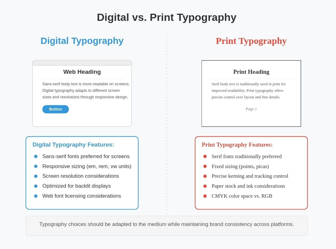
Typography choices vary between digital and print media due to differences in how text is displayed and consumed.
- Digital Typography – requires fonts optimized for screens, often favoring sans-serif typefaces due to their clarity at different resolutions. Web-safe fonts and licensing considerations also play a role.
- Print Typography – offers more control over layout and typography details, allowing for intricate typesetting and a wider variety of typefaces.
The Influence of Digital Typography
The digital revolution has transformed typography, introducing new possibilities and challenges. Web fonts, accessible through services like Google Fonts and Adobe Fonts, have expanded type choices beyond system defaults. Responsive design techniques ensure that typography remains functional and attractive across diverse devices.
Additionally, typographic trends continue to evolve with emerging technologies. Minimalist typography, dark mode optimization, and kinetic typography (animated text) have gained popularity in recent years. AI-driven typography tools are also shaping the future by offering automated font pairing and real-time legibility enhancements.
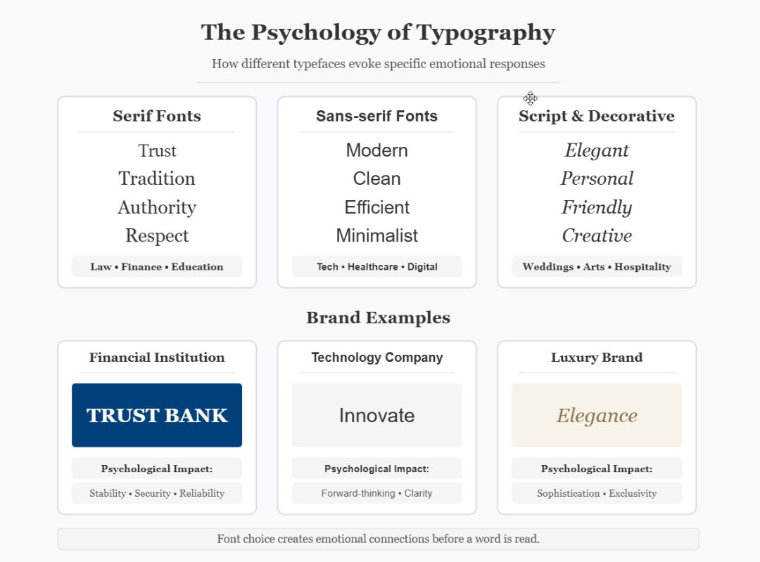
Typography extends beyond aesthetics; it has a profound psychological impact on readers. Studies have shown that typeface choice can influence perception, trustworthiness, and even comprehension. Serif fonts, for instance, are often associated with authority and credibility, while rounded sans-serif fonts evoke friendliness and approachability.
Readability research emphasizes factors like line length, letter spacing, and color contrast. Optimal line lengths, typically between 50-75 characters per line, prevent eye strain and improve comprehension. High contrast between text and background enhances visibility, particularly for individuals with visual impairments.
Challenges and Ethical Considerations in Typography
While typography offers creative freedom, designers must be mindful of ethical considerations. Illegible type choices, poor contrast, and insufficient spacing can hinder accessibility, excluding users with disabilities. Following WCAG (Web Content Accessibility Guidelines) ensures that typography is inclusive and usable for diverse audiences.
Another challenge is font licensing. Many professional typefaces require licensing fees, and improper use can lead to legal issues. Open-source fonts provide cost-effective alternatives while maintaining quality and variety.
Was this article helpful?
Support us to keep up the good work and to provide you even better content. Your donations will be used to help students get access to quality content for free and pay our contributors’ salaries, who work hard to create this website content! Thank you for all your support!

Reaction to comment: Cancel reply